Furniture Color Schemes for Enhancing Productivity
Shape your best workday with intentional color. From calming blues to energizing accents, we explore how furniture hues influence focus, stamina, and creativity. Subscribe for weekly palette ideas, share your workspace photos, and join a community that turns color choices into measurable productivity.
Why Color on Furniture Shapes Your Workday
Research consistently associates blue tones with steadiness and concentration. A navy desk or powder-blue shelving reduces visual chatter, helping your brain prioritize difficult tasks. Try a midnight-blue desktop and tell us if your focus sessions feel longer, smoother, and less interrupted.

Lighting and Finish: Making Your Colors Work Harder
01
Matte vs. Gloss on Work Surfaces
Matte finishes reduce glare, protecting attention during long sessions, while gloss can feel lively yet distracting. For most desk tasks, matte wins for clarity. If you love gloss, reserve it for sideboards or shelves. Tell us where you place reflective finishes to balance energy.
02
Bulb Temperature Alters Perceived Hue
Cooler bulbs push blues greener and can drain warmth from woods; warmer bulbs deepen reds and make neutrals cozier. Aim for neutral-white lighting near your desk to keep color judgments accurate. Experiment for a week and report which bulb temperature steadies your workflow.
03
Daylight Direction and Hue Shift
North-facing rooms skew cooler, so slate and steel blues feel crisp; south-facing spaces warm up woods and terracottas. Test swatches on furniture panels, not walls, to see real-life sheen and shade. Post your before-and-after photos to help others predict their room’s color behavior.
Zoning Your Space With Productive Palettes
Anchor the focus zone with a dark-toned desk—navy, charcoal, or espresso—paired with slate-blue storage. The visual weight signals seriousness and reduces distractions. Share how clearly marked color zones affect your ability to start complex tasks without procrastination rituals.
Zoning Your Space With Productive Palettes
Choose walnut or honey oak with soft coral or clay chairs to encourage open conversation. A warm-toned round table lowers formality and increases idea flow. Try a weekly meeting here and log whether talk-time balances better across your team. Report your findings.


Anecdotes and Mini Case Studies
After swapping a glossy white desk for midnight blue matte, glare vanished and task sequencing improved. A brass lamp added gentle warmth without visual noise. She tracked deliverables and saw fewer revisions. Share your desk color swap and whether feedback cycles shortened meaningfully.
A mint storage cabinet system replaced scattered bins. The soothing green unified materials and reduced search time between lessons. She reported calmer transitions and higher energy late afternoon. Tell us if a single colored storage piece transformed your prep time and end-of-day outlook.
They introduced a coral bench in the huddle area, keeping focus zones navy and walnut. The energetic accent encouraged quick stand-ups, while deep-work desks remained serene. Participation increased. Try a single accent seat and track meeting length versus decision quality for two weeks.
Palette Recipes You Can Try This Week
Navy + Walnut + Soft White
Use a navy desk, walnut shelves, and a soft-white filing cabinet. The contrast stays crisp yet calm, perfect for analytical tasks. Add a linen pinboard to warm the whites. Comment with your alternate soft-white tone that balances screen glare in your room.
Sage + Sand + Black
Pair a sage task chair with a sand-toned credenza and black metal legs. The palette feels grounded without heaviness, ideal for long writing days. Test with neutral bulbs and share whether your perceived eye strain declines after a full workweek.
Charcoal + Mustard + Oak
A charcoal desk anchors attention while a single mustard stool energizes quick ideation. Oak shelving keeps the room friendly, not severe. Resist overusing yellow; let it punctuate. Post pictures of your ratio and note if it boosts short, creative bursts without lingering agitation.
Keeping Your Productive Palette Consistent Over Time
Care That Protects Color Integrity
Use gentle, non-ammonia cleaners on lacquered or painted furniture, and microfiber cloths to reduce micro-scratches that dull color. Rotate sun-exposed pieces quarterly. Share your maintenance checklist and any products that preserved saturation on desks, cabinets, or metal frames.
Seasonal Accent Swaps Without Repainting
Refresh mood by changing a single accent chair, cushion, or storage cart color. Keep core furniture tones stable for continuity. Document energy levels for a month after a swap and tell us which seasonal accent best supported sustained, happy productivity.
Track Mood, Output, and Color Cues
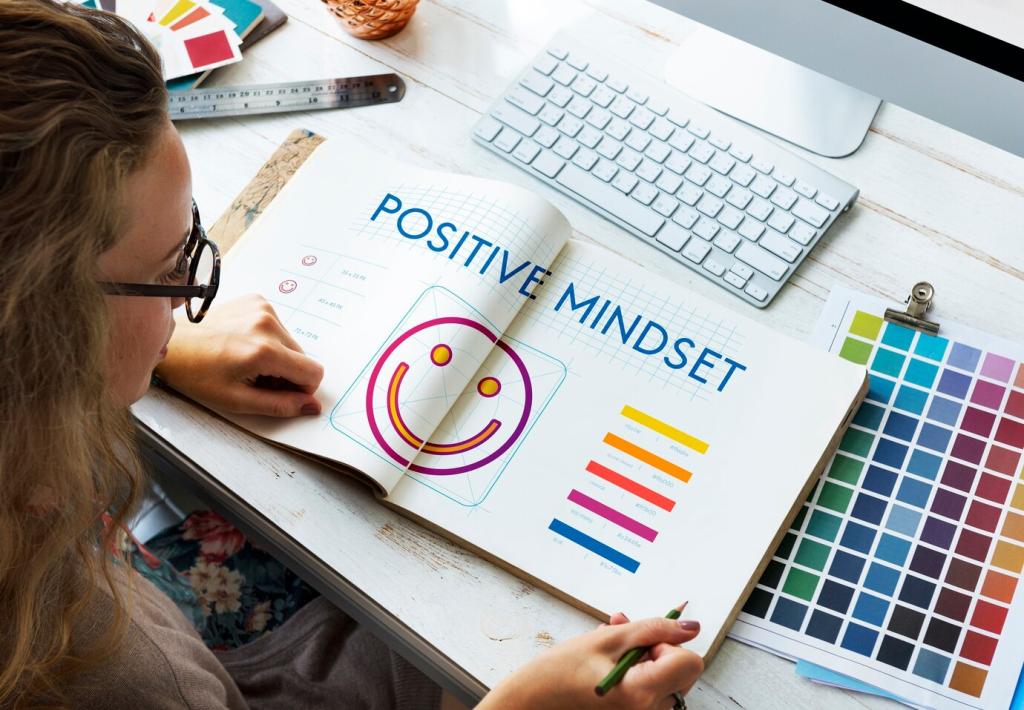
Keep a simple weekly log linking palette changes to focus quality, task duration, and end-of-day energy. Patterns emerge fast. Subscribe to get our printable tracker and share anonymized results so the community learns which schemes reliably move the needle.
